|
When combined with the 10 archers posted here, this is the whole pack of Orcs, plus the King, Wizard, Drummer and Champions - basically everything they make.
|
 |
For the first time, I used Little Big Men Studios transfers to what, I think, great effect! I was really nervous about using them but YouTube was a tremendous confidence booster.
|
I also did a little experiment, using different Speed/Contrast paints for the skin to mix up the complexions. Ironically, Orc Flesh from Army Painter was my least favorite, and one I won't use again for orcs.
I'm using speed paints to do parts on other models usually shoes or small bags, or to basecoat certain areas. But for these I used the slap chop technique 100% apart from the bases.
I undercoat in black, heavy dry brush in a "Craft Mark" Tan, followed by a lighter white drybrush focusing on the tops.
Then I sorted them out by pose. Later, when doing heads, for example I would group them by head, then by weapons. It's just easier to do an assembly line with as few surprises as possible.
I love assembling multi-part plastics trying to make as many cool poses as possible. I didn't always succeed at this but there are some great ones that came out of this. You'll note that I did the shields separately to make sure using the transfers was as easy as possible. More on that later but it dies yield an important consideration: for newcomers, pay special attention to the shield arms and raise them higher than you might expect to give room to the shields when they come. I didn't have room to position all the shields properly on some models because of the angles. Luckily, it was easy to not make it obvious that some shields are being held in a way totally unsuitable for warfare. On to the skin experiments!
 |
I divided the unit up into a bunch of front, mid and rear ranks to ensure the complexions roughly mixed no matter how the unit was assembled for combat. Creed Camo was one of the better colors.
|
 |
This was my least favorite color - too GW for these more serious looking orcs.
|
 |
This was another color I liked - ironically, it is not the color I associate with GW/Citadel orcs
|
 |
This one also was pretty good, but a tad dark.
|
 |
| Let me know in the comments which color you prefer. |
Next I begin to lay down some color themes. I wanted to do variations of purple -some blue, some red, to offset the dark greens of the skins - consult your color wheel.
 |
Some of these colors came out really opaque so I, following a suggestion from S. Fung, very lightly drybrushed that tan again over the lot. This worked great to bring some contrast between highlights and shadows. It also conveys a sort of dirty, wear and tear on much of the cloth. All the skin also got a light touch of pale green intended for zombies - Vallejo Game Color Dead Flesh.
|
On to armor and small details!
 |
Another consideration for the new folks is to be careful how you position your banner bearers arm. I made the position and pole look great without considering the flow of the banner itself. There is NO figure that can accommodate that flag in their space, So this banner will always have to be positioned on the end of the unit to my eternal disappointment.
|
I actually did the shields before I finished the figures because I wanted to see how hard it would be; what if I screwed them up and had to start over? Build new shields? Use different ones? Salvage the old ones? Not to worry, the process was simple and easy.
 |
Step 1: Mount the shields to a flat surface. These are warped wooden odds and ends from Hobby Lobby. Mounted with blue-tac, then hand primed. Airbrush or rattle can would be perfectly acceptable. I did the backs first in black, then after that dried, I flipped and did the front, I probably should have done some planking on the back in dark browns, but it didn't occur to me until many were quite visible after mounting.
|
 |
Step 2: Fine details followed by a wash over the metal bits.
|
 |
Step 3: Per instructions, I painted the surface white to allow the transparent transfer details to show through. Another tip: the white can be done without worrying about edges or especially around the boss. The reason is that the holes on the transfer are slightly bigger than the boss so it shifts around leaving crescents of bright white to show after the transfers are applied. had I left them black it would have save me a lot of tricky touch up work. I went too far along the edges too.
|
 |
Here I had touched up some, but not all of the shields using some dark browns on the darker shields and then I used matching colors with Contrast paints to cover the white edges on the others later but before putting them on the figures.
|
 |
I picked all the bigger shields to show off as much of the beautiful transfer art as possible. These are really beautiful (in an orcish sort of way).
|
 |
Apart from the scale mail and the armored plates, I used NO metallics for the chain mail. That is simply the highlight colors underneath a Basilicanum Gray. In Monty Python's Holy Grail, they don't wear metal by a thick wool shaped into what resembles a chain mail! Looks good on film and pretty good on these guys too!
|
 |
Basing: a three color triad, a base and two highlights of increasing lightness.
|
 |
Another shot at some shields.
|
 |
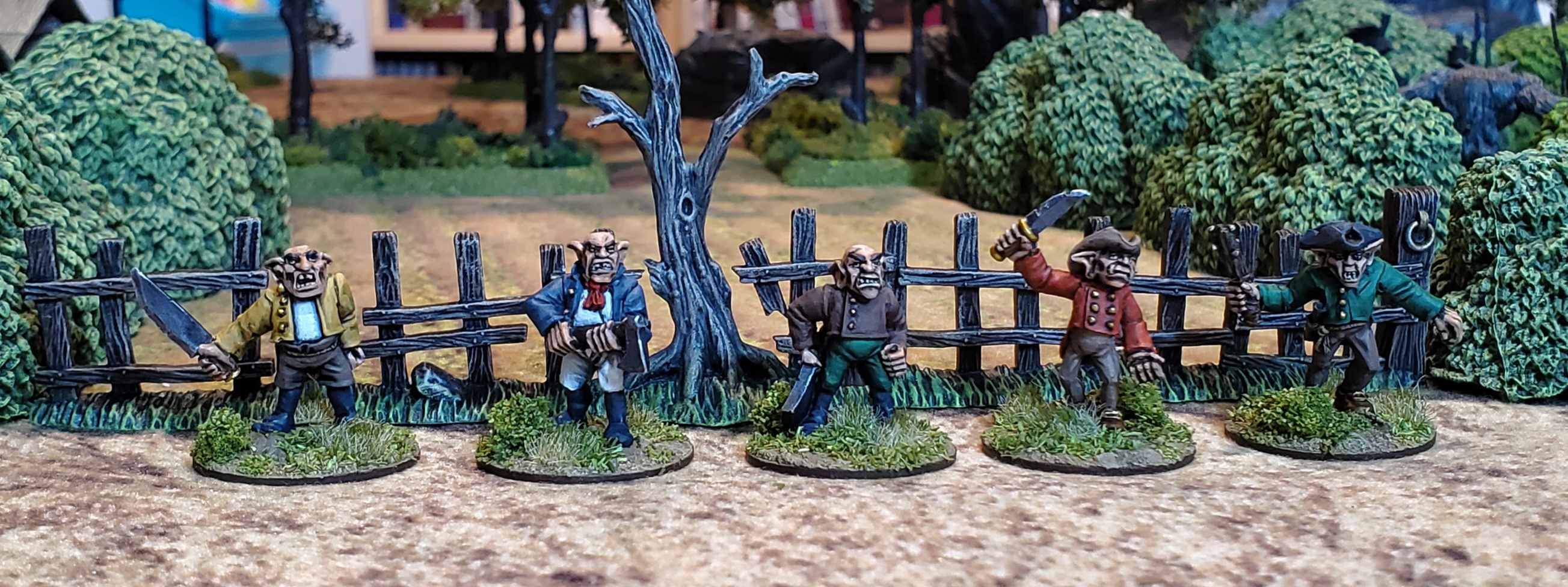
The Champions
|
 |
Wizard, King and Drummer
|
 |
I obviously chickened out on trying some freehand on the shields to match the transfers. A man has got to know his limits.
|
 |
In Afghanistan, certain elder tribesmen have beards dyed red, so I did this guy, the only one with hair showing, in a magenta.
|
 |
The banner was pretty easy too being only one sided. Applied to white paper, I cut it out then primed the back in black. After it was affixed to the pole indicated folds with a pair of grays -deliberately not going for fancy here.
|
 |
Love the way this reddish brown (on left) came out great. that's Army Painter Speedpaint Dusk Red with the tan drybrush to finish.
|
 |
It was figures like this one where I felt painting the back of the shield was warranted. I did that, on this one and others, after this photo session.
|
 |
More good shields!
|
 |
This guy is my favorite of the unit. At the assembly phase, when going through the available heads after the archers, I mistakenly added the ONE leather helmet in the whole unit. I didn't catch it until they were already primed.
|
 |
This is that Army Painter Speedpaint Dusk Red under the tan drybrush - looks better in person of course.
|
 |
The archer champion slunk away to join his unit and though I have Dwarves primed and pre-highlighted for another slap chop venture, I may do the Human Light Infantry first. Or maybe Napoleonics?
|
Thanks for looking - questions, comments and followers are welcome and encouraged! I'm doing more and more on Facebook so follow my page there too! https://www.facebook.com/One-of-My-Men-Became-Restless-100659928063858